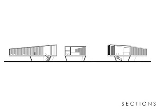
The last step of the project was based more on developing constructions and textures details.
The whole construction leans on one big long span beam plus two other vertical beams
situated on both opposite sides of the building (-2 floor).
The roof construction is part of the design.
Trusses provided are exposed inside the building in order to create a feeling of a massive space.
For that reason the staircase which is the main furniture of the extension was enlarged as well.
They are bigger now with more massive wooden railings.
The long glass curtain wall on the -2 floor is adivision between
inside and outside space is now divided into three separate sliding window openings.
The glass can still be considered as one piece
thanks to the Vitrocsa company which creates almost invisible wall system.
As a reference we could provide Breuer’s project.
He created strong and heavy modernist building in New York - Whitney Museum.
The inner space he created under ground level was our inspiration.
For walls we used simple greyscale plaster finishing.
Almost all in grey except cafeteria where the white dominates to obtain bright space.
Level 0
The view from the stairs on level -2
The view from the stairs between level 0 and -1

Conference room


